For years, web design was dominated by the “hero image plus alternating features” formula. It was safe, it was responsive, and—let’s be honest—it became a bit boring.
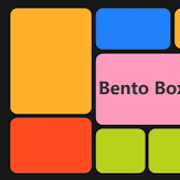
Enter the Bento Box layout. Inspired by the compartmentalized Japanese lunch box, this design trend has evolved from an Apple-inspired gimmick into the gold standard for high-end UI/UX in 2026. Whether you’re building a SaaS dashboard or a creative portfolio, here is why the bento grid is taking over and how to master it.
Why Bento Grids Are Winning
The shift isn’t just about looking “cool.” It addresses two major challenges of the modern web: information density and scan-ability.
- Visual Hierarchy at a Glance: Unlike traditional lists, a bento grid uses variable cell sizes to tell the user what matters. A $2 \times 2$ block naturally draws more eyes than a $1 \times 1$ block, allowing you to “rank” information without using massive headers.
- The “Widget” Expectation: Thanks to iOS and Android home screens, users are now conditioned to consume data in modular “chunks.” Bento layouts mirror this mental model, making the interface feel familiar and “app-like.”
- Responsive by Nature: Because each cell is a self-contained unit, reshuffling them for mobile is seamless. On a desktop, they spread wide; on a phone, they stack into a logical vertical stream.
How to Implement Without the Clutter
The biggest risk with a bento layout is the “Frankenstein” effect—where your site ends up looking like a cluttered basement. To avoid this, follow these 2026 design principles:
- Respect the “Gutter”: Consistent spacing is the secret sauce. Successful layouts typically use a $16\text{px}$ to $24\text{px}$ gap between cells. If your gaps vary, the layout will feel “off” to the subconscious eye.
- The Power of Negative Space: You don’t have to fill every box. Sometimes, leaving a cell empty or using it for a simple, atmospheric gradient gives the user’s eyes a place to rest.
- Rounding the Edges: Sharp corners create visual tension. Modern bento designs favor a “soft” aesthetic—aim for a border-radius between $12\text{px}$ and $24\text{px}$ to make the boxes feel tactile and friendly.
- Micro-interactions: In 2026, a static bento box is a missed opportunity. Add subtle hover effects, like a slight lift or a change in background blur (Glassmorphism), to signal that the box is interactive.
When to Avoid It
Bento boxes are great for summaries (dashboards, feature lists, pricing plans). They are not great for long-form reading. If your content requires a linear narrative—like a 2,000-word case study—stick to a more traditional flow